
An infographic display of the most searched for Netflix Originals anime in every country in the world.
Official Snowpiercer timeline

Titan Comics have put together an official timeline for Snowpiercer.
This is what D&D’s best year looks like [infographic]

Wizards of the Coast have released a press release for European media to say so and in it is a large infographic to celebrate their best year.
Crunchyroll releases Winter 2020 stats; Black Clover dominates

Anime streaming kingpin Crunchyroll has today released a range of top 10 infographics.
Monopoly data visual: What 20,000 games teach us

Here’s where you’re going to land in a game of Monopoly. Build your empire accordingly.
A visual history of Mind Flayers in popular culture [infographic]

What’s the difference between a mind flayer and an illithid? licensing laws.
57 years of different Spider-man costumes [infographic]

What about that dark, Spider-man Noir-ish, costume that seems to be in Far from Home?
Vampire: The Masquerade becomes only the second RPG to win the Origins Award twice

An animated tour through the winners of the Origins Award for Best Role-Playing Game.
Charts can be cool: Interactive Pokemon data visual
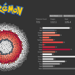
Clicking on any of the dots in the Pokeball graphic highlights the Pokemon in question and reveals the type associated with it.
Game of Thrones: Deadliest Weapons – An Illustrated Guide [infographic]
What’s the most deadly weapon in a Game of Thrones? Has poison killed more people than wildfire?
