
Bingo site Two Little Fleas has been inspired by old Pokemon cards selling on eBay for £1,200 (and there are many scary prices for cards on Ebay). They’ve also been driven by the need to get in touch with gamers. The result? An infographic that worth of old toys if you were to sell them today. […]
Interactive Map of The Battle of Five Armies

Duh! Alert! If you don’t know how The Hobbit ends then this interactive map contains spoilers. From a hole in the ground and Bilbo all the way through to the Battle of Five armies – there’s a lot that happens in the relatively small The Hobbit. Enough for three movies! Well. Perhaps. The Shirts.com team […]
The ultimate history of card games [infographic]

This infographic suggests that card games can be traced back to China and between 618 AD to 907 AD. Baccarat appears around about the 1400s as an early gambling game and we don’t get Solitaire or Patience until about the 1700s in Europe. Rummy and Gin Rummy are American inventions as is the Joker card […]
Surprising facts about Wolverine’s costume [infographic]
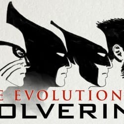
It turns out that the iconic yellow and blue is not the costume which had the single longest run when it comes to Wolverine. However, he’s worn yellow and blue more often than any other colour. He’s also been without a nose. Need to know? This is a costume catch up infographic via Halloween Costumes.com.
The hypnotic visualisation of the screen time for 65 Game of Thrones characters
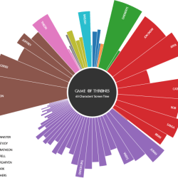
Which Game of Throne characters have had the most screen time? Has House Lannister had more of the limelight than House Stark? See the Pen Polar Area Chart (Game of Thrones) by Desmond (@DesmondW) on CodePen. This impressive and interactive visual is the work of designer and developer Desmond Weindorf. It uses data from the […]
10 urban myths of gaming [infographic]
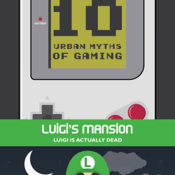
What computer game myths do you know? Are any of them believable? In fairness to the team at Liberty Games, who put this piece together, the Luigi’s Mansion myth is believable and it’s the sort of secret twist that’s in keeping with the company even if not the game franchise.
Here’s why you should be a kind geek – you never know what’s going to happen

How’s this for alternative futures? Two alternative timelines, all based on being kind. Destroy the queen! (Via Imgur)
How long did each Doctor regeneration live for?

This infographic uses the minutes of screen time each Doctor regeneration appeared for to calculate a timeline. Special shows like Christmas and Anniversary episodes counted for one hour. We can see that the 1st Doctor did pretty well but it was Tom Baker as the 4th who has, by some distance, the longest screen time. […]
Superhero Week: The growth of geek culture

This infographic was shared by Jim Zub (Pathfinder, Samurai Jack comic books) and uses one little icon to represent every 10,000 visitors. Several shows missing from this convention attendance list, but still fascinating to see pop culture growth. pic.twitter.com/ueMX7aANh8 — Jim Zub (@JimZub) June 24, 2014 Win an Amazon voucher by following “Superhero Week”. Pop […]
How many times did they die? 50 years of X-Men [infographic]

I know. I know. Infographics have to work very much harder to be worth your time and attention these days. I think this one, from Shirts.com does. It uses visuals to help you track when various X-Men first appeared, when they stopped being mentioned (often because they died) and when they appeared again. Professor X, […]
